Helping the fastest team in NASCAR make smarter moves, faster.
9 min read
Video produced by Microsoft
Hendrick Motorsports is the most successful team in NASCAR history, with a record 12 championships since 1984. Their business runs on innovation—and a relentless drive to win.
The Opportunity
When NASCAR limited the number of pit crew members allowed on the field, teams had to adapt fast. To level the playing field, NASCAR granted access to real-time telemetry data for every car. Partnering with Microsoft Azure, we built a new tool that gave Hendrick Motorsports' race engineers a data-driven edge on race day.
Outcomes
The success of the MVP led directly to a second phase of development, driven by adoption from the race engineering team.We led a distributed team across North America and the UK to design, build, and ship the product on a tight timeline.The tool was built to take full advantage of Microsoft Surface hardware and Azure's cloud computing capabilities.A collaborative, iterative approach kept us within scope—without compromising innovation or execution.The track view
The Team
Creative strategy Design oversight Research UX / IA Martin Hughes UI Lanny McNie Proj. Manager Eddie Chu Dev Alex Garneau Dev Hendrick Race Engineers 2 Hendrick Project Manager 1Microsoft Hendrick Motorsports gskinner
The Challenge
How might we help race engineers make smarter turn-by-turn strategy decisions—by surfacing the biggest opportunities to reduce lap times and cut down communication cycles with drivers using a brand-new dataset?
The Basics
Drivers and a twenty-person race engineering team.A Windows Surface application (or any computer running Windows).On the track in broad daylight, and off the track under artificial lighting.During practice, live races, and post-race debriefs.To win races by optimizing turn strategy better than anyone else on the track.
Vision
At every track, Hendrick has the fastest lap on record—and the goal is to keep it that way.
Considerations
Teams at Microsoft and Hendrick were looking for different types of value from the project—technical innovation on one side, competitive advantage on the other. Our team collaborated with race engineers remotely. Clear communication, a focused process, and the right tools helped us overcome the challenges of distributed work.With designers in the UK and Canada, we built asynchronous workflows that made collaboration smooth—no matter the time zone.
Leveraging a distributed team
By working across time zones, I shortened iteration cycles—using a 24-hour loop between UX and visual design. With one designer in Canada and another in the UK, we moved from concept to refinement overnight.
End-user participation
Daily syncs with race engineers kept our ideas grounded in real-world needs. These fast feedback loops helped validate assumptions, uncover missing context, and keep end users meaningfully engaged throughout the project.
Problem Definition
A living brief
To set the team up for success, I created a living document that evolved throughout the project. Research insights, user feedback, and technical constraints were added as we uncovered them—turning the brief into a shared reference point for evaluating ideas and making confident decisions.
Research insights
We kicked off with interviews over video calls to understand the tools, workflows, and pain points of the race engineering team. I supplemented these with online research and gathered videos and screenshots of existing tools to learn how they were used, what they lacked, and where they provided the most value. This work helped shape a strategy focused on complementing—not duplicating—what already existed.
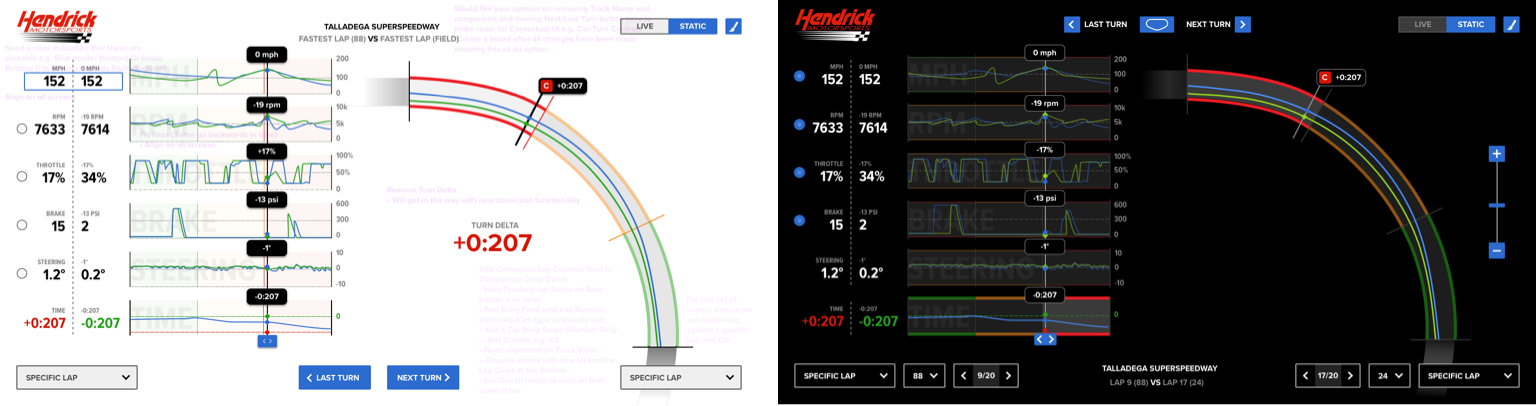
Race engineers focus their attention where the biggest time savings happen. Any tool we built needed to highlight those opportunities clearly—especially through time delta comparisons.Teams track whether they're getting faster or slower, lap over lap, through a turn, across a section, or compared to the fastest driver or manufacturing brand. Trending data needed to be both visible and actionable.If telemetry like braking, throttle, RPM, or line choice is buried or hard to read, engineers miss chances to improve turn strategy. Prioritizing these data points was non-negotiable. Engineers need to communicate fast—but also with enough detail to paint a clear picture. The interface needed to support both.Instructions like “Lift 200 feet earlier” are precise, clear, and fast to communicate. Tools had to reflect this style of interaction.Every team had access to the same telemetry. Advantage would come from better tools and smarter integration.Currently, it takes up to 12 laps for engineers to analyze data and pass insights to the driver. Cutting this down would mean faster decisions—and better outcomes.Pre-race planning and post-race analysis matter, but wins happen on race day. Our design had to support live decisions at high speed.If Ford is gaining time, Hendrick's engineers direct spotters and pit crews to monitor and adapt. Our tool needed to support that level of situational awareness.Talladega holds the record for the fastest lap in NASCAR—just under 45 seconds. In a world where milliseconds matter, better tools don't just support performance—they define it.
Guiding Principles
"How quickly you can make the right decision is a huge difference in winning or not."You have 10 seconds—and you just spent five reading this. Insights should be instantly visible, with the most meaningful opportunity front and center.The next critical insight should be immediately accessible—or one click away at most. The context changes between practice, race day, and post-race review. During a 12=16 second pit stop, every detail must be digestible in real time.Don't make engineers dig for differences. Show the right data, in the right context, at the right time—so decisions aren't delayed by interpretation.Data must be readable in full sunlight, high heat, and the roar of 200mph cars. This isn't a quiet office—it's the pit wall.Metrics are good. Showing the goal is better. Give teams a clear benchmark so they know what they're aiming for.In two laps—roughly 60 seconds—the team needs to spot the opportunity, choose a course of action, and relay instructions to the driver.This is the most technologically advanced team in NASCAR. The bar is high—let's build something truly new, not just different.
Core Strategy
Focus on deltas. Make it easy to compare data, spot the biggest opportunities, decide what to correct, and shrink the time between analysis and driver communication.
Exploration
Designing within constraints
Innovating on a fixed budget meant focusing our efforts. I explored and presented solutions that directly addressed user challenges while staying aligned with our core strategy.
Collaboration and value-driven decisions
Throughout exploration, we partnered with the client, developers, and project managers to evaluate the cost and impact of each idea. Together, we shaped a value-focused MVP that delivered meaningful features—on time and within budget.
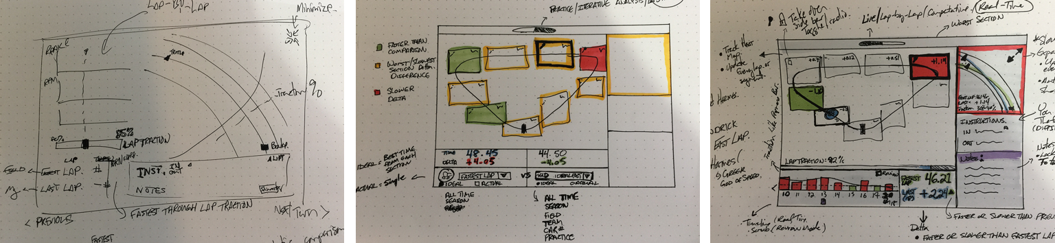
An Iterative process
Tightly scoped design sprints kept feedback flowing and iteration cycles short. Each round brought the team closer—from rough UX concepts to refined, high-fidelity designs—while keeping the Hendrick team engaged every step of the way.
Early concepts and prototypesWireframes, IA, InVision PrototypingVisual style explorationHi-fidelity design
Having two designers on the project deepened our exploration and accelerated delivery. By working in parallel—using divergent and convergent design methods—we explored broadly, then folded the strongest ideas into each other's work. The result: richer solutions without slowing the pace.
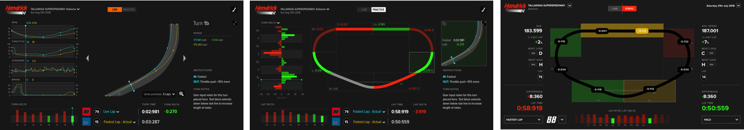
Designing for real-world conditions
The app had to perform in tough lighting—from direct sunlight at the track to dim garages post-race. We tested design comps with race engineers on real devices, using their feedback to guide light vs. dark mode choices and ensure readability where it mattered most.
User testing helped us make the right decisions quickly.
Minimizing risk
Designing for every edge case can be time-consuming—and risky. To streamline validation, we identified and tested against opposing extremes. This let us evaluate whether UI and UX decisions would hold up across a wide range of real-world scenarios.
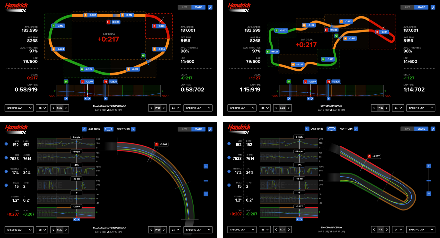
I used track complexity, total number of turns, and turn types to define those extremes.
Talledaga vs Sonoma (Simple/Complex)
Focus on delta's
Our guiding principles shaped everything—from high-level concepts to individual product details. Every feature aligned with a single purpose: to surface performance deltas and improve how quickly the team could act on them.
The images show how Focusing on deltas translated into design exploration.
Finding the opportunity
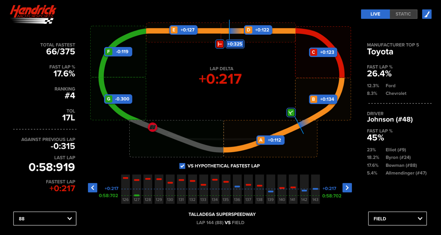
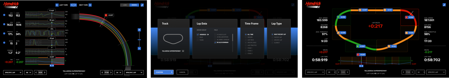
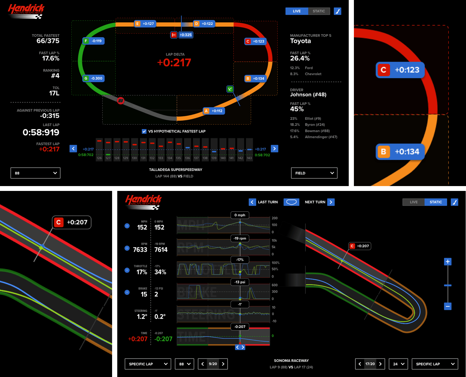
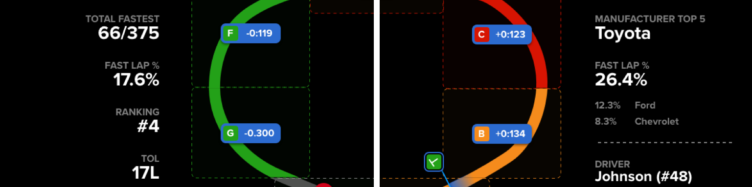
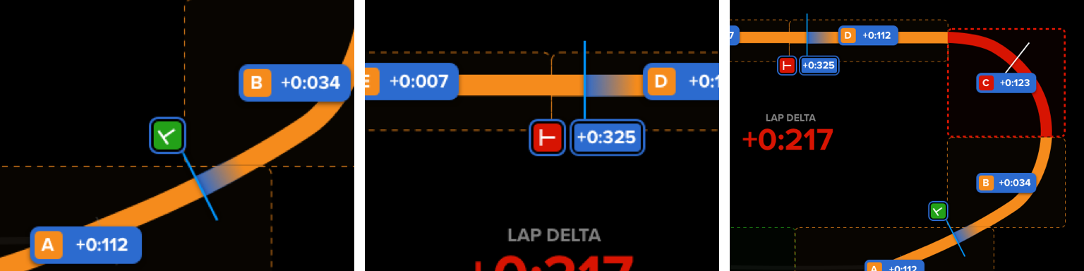
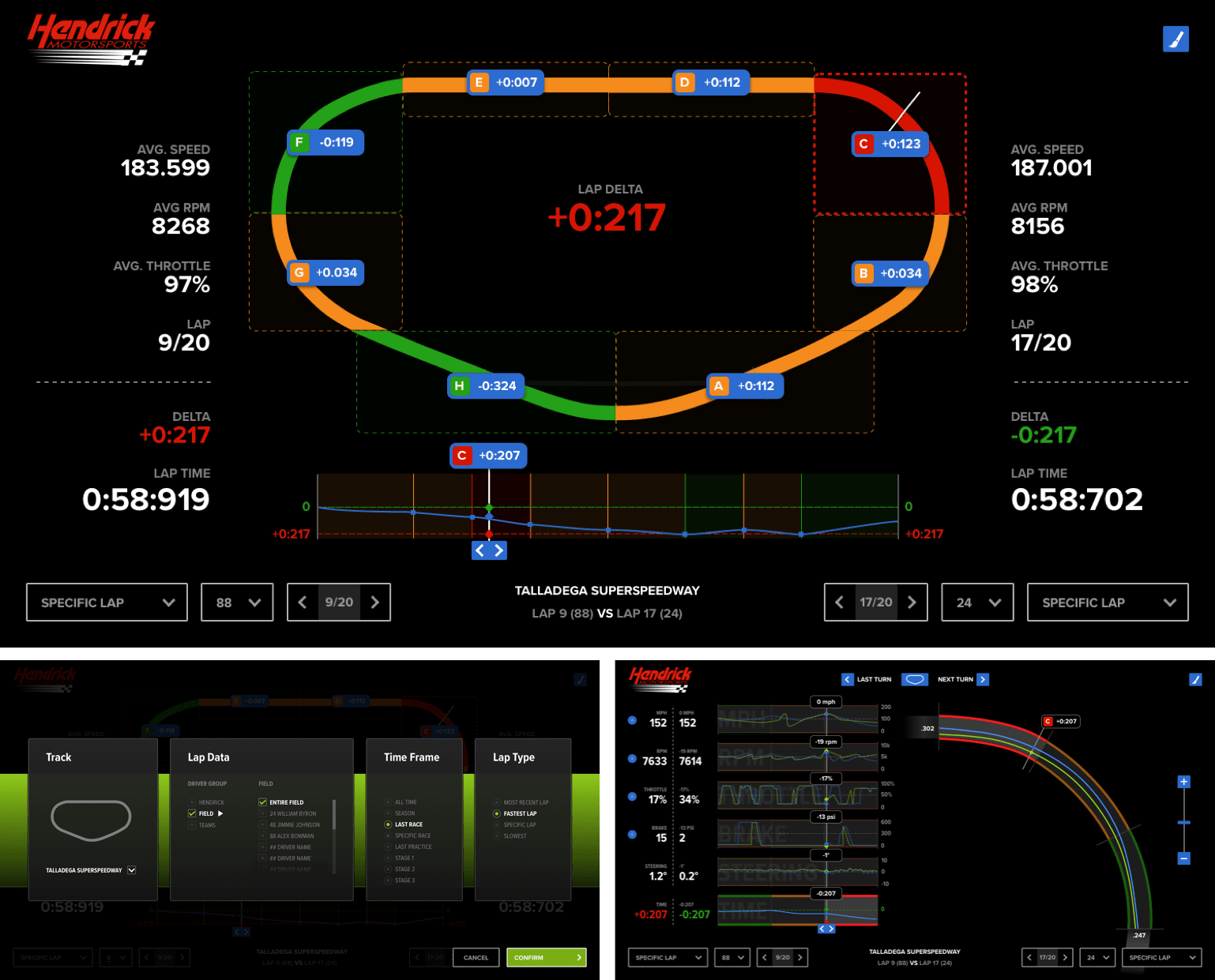
In a live race, there's only 60 seconds to spot the problem, analyze the data, and recommend a change. Identifying where the most time can be gained is critical—and in our design, color tells the story.
The single section of Red track indicates where the most time can be gained.
Quick access
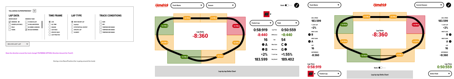
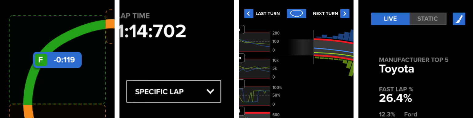
To maximize analysis time during 60-second lap intervals, we minimized navigation. From the core lap view, race engineers could jump into any turn, move seamlessly between them, and customize the data they saw. Switching between live and static modes was also made easy—so engineers could pause the action and zero in on critical moments.
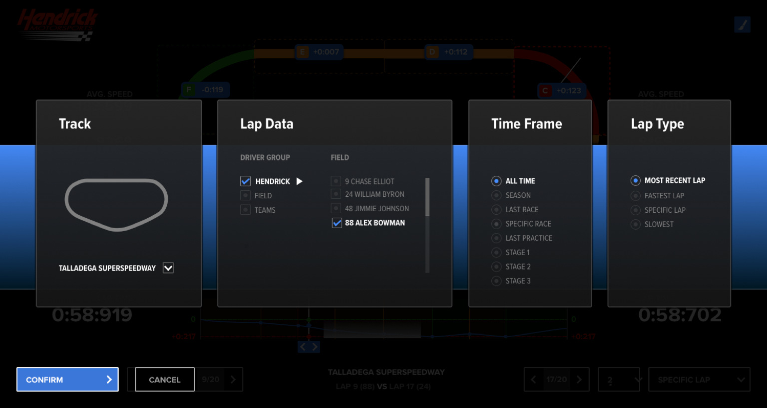
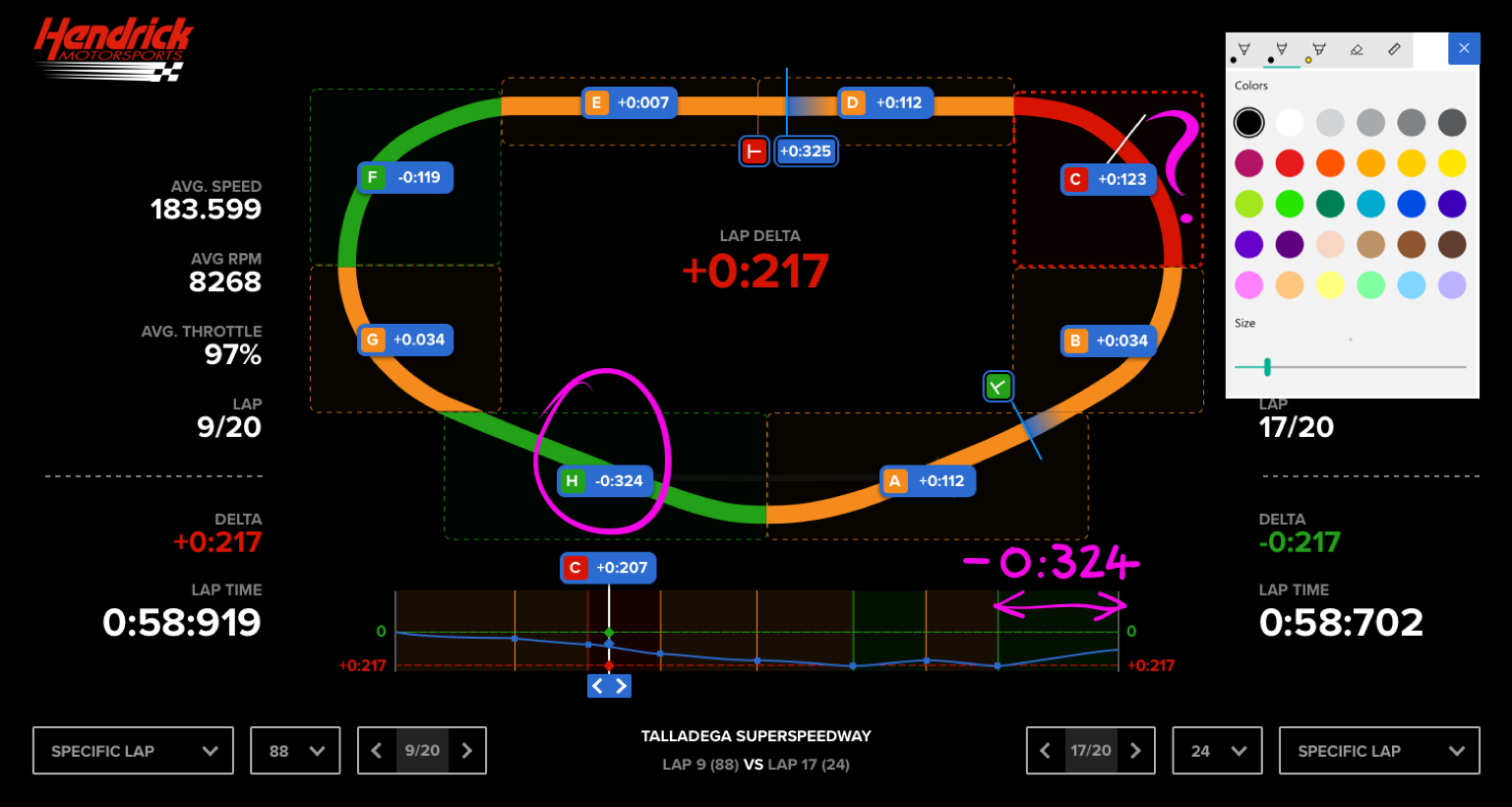
Turn Details, customize data, full lap view, change viewing modeA highly customizable interface for filtering datasets facilitates a broad range of analysis.
A new metric
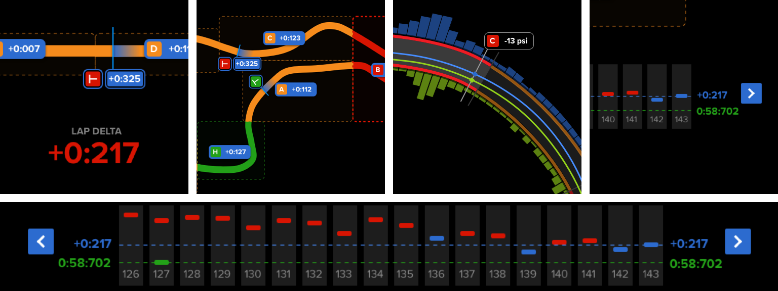
With access to field-wide data, teams can now track which drivers, teams, and manufacturers hold the majority of fastest laps—what we call fastest lap percentage. This gives race engineers a quick way to spot who's gaining ground, and who they need to watch during the race.
See how your driver stacks up against the competition.
Custom Turn Segments
The NASCAR dataset came with pre-set turn boundaries—but they weren't ideal for analysis. To give engineers more flexibility, we designed a simple way to define custom turn segments by setting their own in and out points.
This allowed the team to analyze any section of the track, at any length, based on what mattered most in the moment.
Data for a custom turn can be set by adjusting 'in' and 'out' markers on the track
We quickly realized that building a full UX for custom track segmentation would exceed the MVP scope. Instead, we provided a simple config file the Hendrick team could use to define custom segments and augment the data on their own.
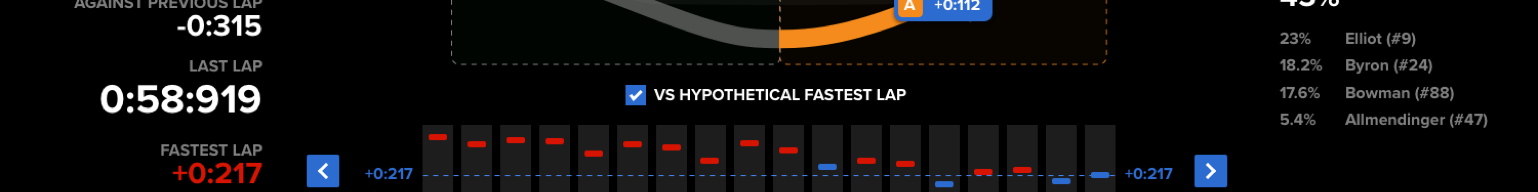
The pursuit of the perfect lap
What if you're already the fastest car on the track? When there's no single competitor posting quicker laps, finding performance gains gets harder. So how can a tool help you go even faster?
By analyzing each turn segment independently, we searched the dataset for the best time recorded on every turn. Stitching those together creates a hypothetical fastest lap—a composite of peak performance.
This gave race engineers a new way to uncover opportunities for improvement, even when their team already held the fastest lap.
Compare performance against the entire data set.
Note taking
With Microsoft Ink, race engineers can quickly annotate the interface—making it easier to communicate critical insights to drivers during pit stops.
Instantly markup any screen.
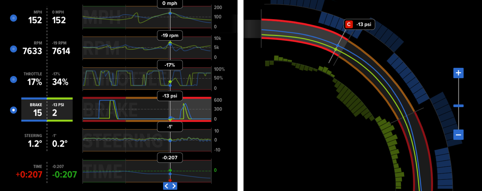
Contextual data visualization
We explored ways to visualize data like braking and steering directly on the track, aiming to deliver instant, visual insights that could speed up communication.
But when mapped to complex segments like hairpin turns, the visualizations became noisy and hard to read. We made the call to set this challenge aside—acknowledging it was outside the scope of the MVP.
This exploration maps data than can be positive or negative to a wide turn.
Solution
Working closely with the Hendrick team, we prioritized the features that would deliver the highest return in the MVP. We scaled back implementation where needed, cutting low-value features that were too costly or time-intensive.
The result wasn't just a focused product—it became a foundation. Many of the ideas that didn't make it into the MVP went on to shape the future roadmap.